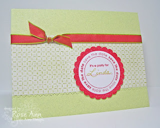
This is a simple invite I made using my It's a Party! set from Lizzie Anne Designs. The patterned paper is Sushi Journey (7 Gypsies) that I purchased at Jacksonbelle's store. I used my Ornare template for the piercing. The colors match IRL, but they don't look it here. Anyone have some tips for Adobe Elements Studio to get correct lighting and colors? Any help would be much appreciated.

Thanks for visiting!!
Stamps: It's a Party! (Lizzie Anne Designs)
Card Stock: Archivers, Georgia Pacific White, Sushi Journey (7 Gypsies)
Ink: Riding Hood Red, Gold Spica glitter pen
Accessories: Paper Piercer tool & Ornare template (4.055.583), May Arts ribbon


17 comments:
Ooohhh! I love this color combo! I'm no help with Photo Elements - I just use the auto adjust! But I think your photo is great - and so is the card!
I'm sure there's more knowledgeable people than me but for me, natural light only - no flash. I have a little table on my front porch where I always take my photos, now. An PE instructor told me that dreary days are really good days. I always take my photos before the sun reaches that side of our home. You can adjust lighting once you have your photo loaded on your computer. Email me if I can help you more. Sweet card (as usual).
Love it! Love the color combo!
I'm using a really old version of PSE (2) so I'm not sure how much help this will be...
Since I take alot of my photos at night the lighting is always off. I usually manually adjust the bright/contrast sliders (ctrl + L) and adjust the color hues(ctrl + U) both under "enhance". I just play around with the sliders until it looks a bit more accurate to me. sorry, not too specific but I hope it helps.
Sweet and simple...nice job Rose Ann!
Fabulous card Rose Ann! Love the color combination. That piercing template is so cool.
Love your card, Rose Ann! I am not much help with PSE, but please share if you find some great tips!
Rose Ann, I love the card and the colors! I'm afraid that I myself am not even that good at PSE (3)! I'm afraid I can't add anything to what has already been said. Good luck though!
this is a beautiful card Rose Ann, love the colours :) x
Simple or not, it's a gorgeous card. I have Adobe Photoshop 5. I use natural light whenever I can.
Have a wonderful day
Hugs and smiles
it's still a thorn in my side (I prefer to take pics out on the back patio but working full-time does not jive with my stamping schedule SO I use PSE4 or 5 and adjust lighting/contrast no more than 10, I take the photo with my OTT light & no flash on the camera. pretty card!
Your card is so pretty Rose Ann!! I do use PS but recently I've been using Picasa (a free Google product) to crop, sharpen and adjust the color - it's easy easy and works great!! Then I just go to PS to add my watermark. Hope it helps! :)
Love this Rose Ann!! The color combo is fabulous!! *STAMPIN HUGS* Alex
I'm clueless about Adobe but I sure do like your card! I thought it was a JustRite stamp at first. How cool and so very useful! I think your photograph looks fine, but I know there's nothing like seeing it in real life. I have those very frustrating problems, too.
Oh my, Rose Ann!
I love these colors, and the card design is perfect to show off the stamps!
Pretty! I love these kinds of cards - simple but very pretty!
I love the simplicity of this, Rose Ann! Great colors too!
Love this design, Rose Ann. Really like the pop that the piercing at the bottom panel ads. Beautiful!
Post a Comment